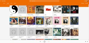
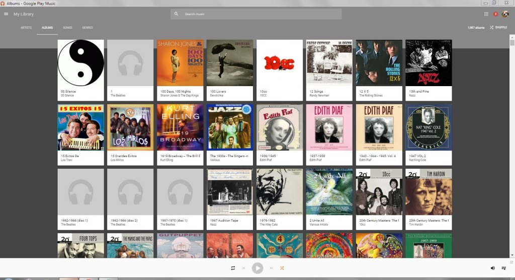
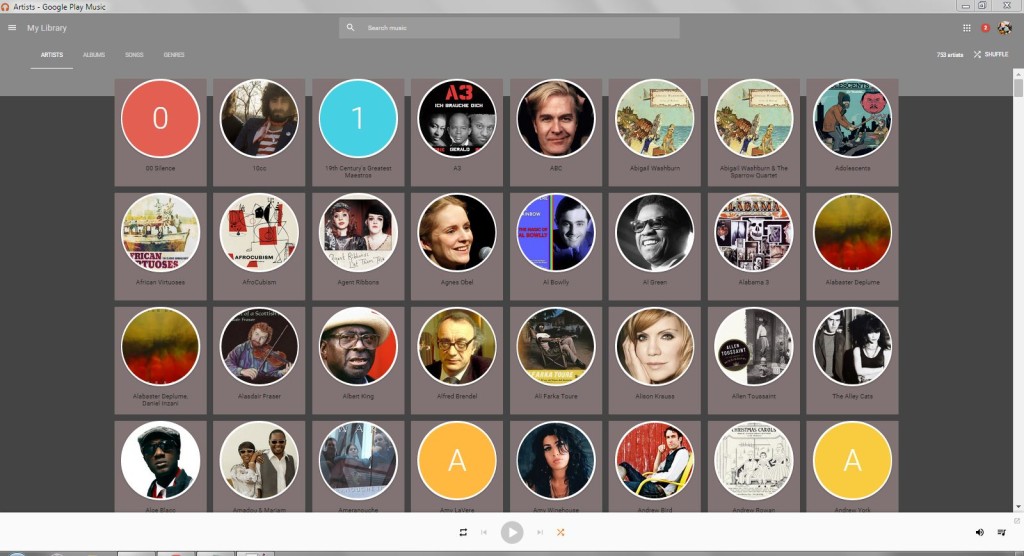
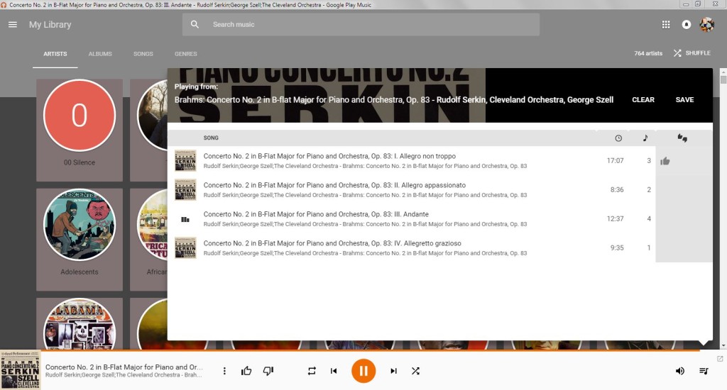
Summer 2017 Google Play Music Stylebot makeover

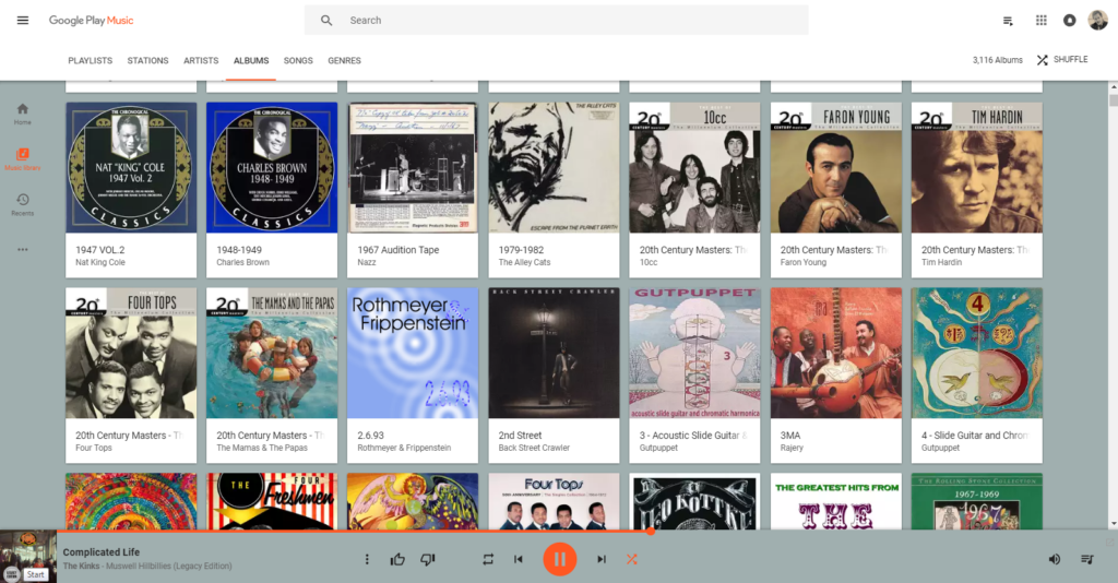
I’m back from a sojourn using the Google Play Music Desktop Player* — and while I was ‘away,’ looks like Google rolled out some changes that pretty drastically changed the looks of GPM in the browser — but didn’t have much effect on the Grey Flannel Cool Skin. It should continue to work well.

But, you know, it was time for a change so I whipped up a nice, clean, lightly colored new skin for GPM using the Stylebot Chrome extension. Let’s call it Cool Pale Green.
Stylebot normally has a website that allows users to post and share their skins — and has a slick style browser and pushbutton install — but the site is temporarily not in business (though the developer plans on bringing it back when professional time pressures allow). Meanwhile, the Stylebot Extension is still freely available in the Chrome Extensions store at Google Play.

To install Cool Pale Green once you have the Stylebot extension installed in Chrome, look for and click the small css logo-button in the Chrome toolbar, Open Stylebot, click the Edit CSS button at the bottom of the page, paste the CSS code below into the window. If Live Preview Changes is checked and GPM is loaded, you should see the change immediately. Click Save. Enjoy.

Cool Pale Green 1.2 (2017-08-07)

#auto-playlists-header {
color: #000000;
}

#playlist-drawer-header {
color: #000000;
}

#playlists-header {
color: #000000;
}

#recent-playlists-header {
color: #000000;
}

a.home-palette-id-2.tooltip {
color: #000000;
margin-left: 4px;
}

a.playlist-wrapper {
background-color: #ffffff;
}

a.title.fade-out.tooltip.gray {
background-color: #ffffff;
border-bottom-width: 1px;
border-color: #333333;
border-left-width: 4px;
border-right-width: 1px;
border-top-width: 4px;
}

div.autoplaylist-section {
background-color: #ffffff;
}

div.details {
background-color: #ffffff;
border-bottom-width: 0;
border-color: #ffffff;
border-left-width: 0;
border-style: solid;
border-top-width: 1px;
}

div.details.style-scope.sj-card {
background-color: #A0AFAF;
border-color: #A0AFAF;
}

div.flex.style-scope.paper-header-panel {
background-color: #A0AFAF;
}

div.material.active {
background-color: #A0AFAF;
font-weight: bold;
}

div.player-artist {
font-weight: bold;
}

div.playlist-title {
color: #000000;
}

iron-icon.style-scope.paper-icon-button.x-scope.iron-icon-1 {
padding-top: 8px;
}

paper-toolbar.animate.x-scope.paper-toolbar-2 {
background-color: #A0AFAF;
}

span.home-palette-id-2.tooltip {
color: #000000;
margin-left: 4px;
}

tr.song-row.selected-song-row td {
background-color: #DBDBD9;
}

paper-toolbar.animate.x-scope.paper-toolbar-0.medium-tall {
background-color: #A0AFAF;
}

paper-toolbar.animate.x-scope.paper-toolbar-0 {
background-color: #8a9e9e;
}

When GPM is loaded, the CSS mods above will be applied in the browser. Other sites will look as they normally do.

Also, consider creating a ‘desktop app’ of Google Play Music so that it opens in its own window instead of a regular browser window (Chrome browser menu/More tools/Add to desktop). Gets rid of the browser header and tab area and devotes the whole window/screen to GPM.

That’s it — that’s all there is!

*Google Play Music Desktop Player is a free, third party workalike of the desktop browser-based version of Google Play Music — with some added features like pause-after-currenttrack [currently broken by changes to the underlying GPM, apparently], lyrics display [also currently not operable], a simple ‘clock radio’ alarm, and a basic light/dark theme choice (with some additional but largely undocumented abilities to modify the style via inserted CSS). I like it — but, as noted, some of the key features don’t work. Also, while it behaves very well in background, it takes a long, damn time to load. I mean long. GPM loads my (huge) stream library in about 5-10 seconds. GPMDP (as it’s known to its fans) can take 30-45 seconds to load. (But it’s oriented to just leaving running in the background — the ‘x’ button doesn’t actually close the player, it just minimizes it, you have to go to the tray icon to fully ‘quit.’)

https://www.googleplaymusicdesktopplayer.com/
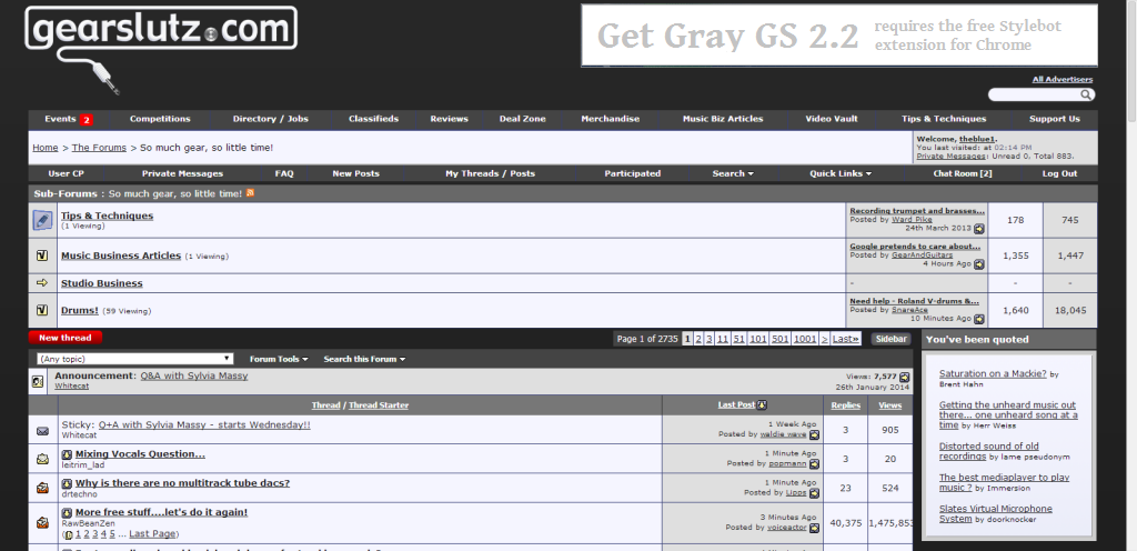
 

Introducing Gray GS — a new, flat design restyle for the world’s busiest record engineering site

GrayGS2.2-Stylebot-c2

How to Install the free Gray GS 2.2 style for the recording gear site, Gearslutz

  •  if you don’t already have the free Stylebot extension for Chrome, select:
     Chrome menu / tools / extensions / click  ‘get more extensions’ at the bottom of the page
    and install the free Stylebot Social extension — it only takes a couple seconds
Stylebot-Install-button

Fig. 1

  • once you have Stylebot, go to the Gray GS 2.2 page at http://stylebot.me/styles/4871 and use the style-install button you find there  [fig1]  — that’s all there is to it!

The next time you vsit Gearslutz, you should see a sleek, new flat design look. And a lot less purple.

But don’t worry, you haven’t hacked the actual site — just how it looks in your browser!

And you can turn it off anytime or look for other restyles for GearSlutz — and other sites — just click on the small Stylebot css button in the Chrome toolbar — you can preview the restyles instantly from the Stylebot install from social option.


If you have any problems just use the Stylebot css button to remove the style or choose a different style from those available. If you do have problems, please feel free to leave a comment on the Gray GS 2.2 page.

Gray Flannel Cool 3.2 – Make Google Music look as cool as it works

UPDATED: Now with WIDE QUEUE WINDOW

Google Music player 
GPM makeover May2015 Before

Before…
[May 14, 2015 Google makeover]


After applying Gray Flannel Cool…GPM-GrayFlannelCool-May17-Artists
Gray Flannel Cool artists page…
GooglePlayMusic-GrayFlannelCool-2015-05-17-Artists


How to Install the Gray Flannel Cool style for Google Music  

Stylebot-Install-button

Fig. 1

  • Once you have Stylebot, go to the Gray Flannel Cool page at http://stylebot.me/styles/4844 and use the style-install button you find there  [fig1]  — that’s all there is to it!


The next time you use Google’s online music player, you should see nice, muted content-forward neutral backgrounds. But don’t worry, you haven’t hacked the actual Google Play Music page — just how it looks in your browser! 

And you can turn it off anytime or look for other restyles for Google Music  — and other sites — anytime you like, just remove the current custom style, click on the small Stylebot css button in the Chrome toolbar — you can preview the restyles instantly from the Stylebot install from social option.


The second most important hack to make Google Play Music fun and easy:

Turn Google Play Music into a desktop app! It’s EASY!*

In Windows: Set up Google Play to the view you want to open. In the Chrome menu (click the ‘hamburger’ menu icon in the upper right toolbar area) go to  More tools / Create application shortcuts, and check the boxes where you want the Windows shortcuts to go.

Added bonus, you can make a separate app for each of your favorite views — even for individual playlists! I have separate shortcuts for the Library Albums page and my favorite day-starting playlist.

*Mac users may want to check this article:
http://computers.tutsplus.com/tutorials/quick-tip-make-a-chrome-app-shortcut-for-any-web-app–cms-21221

Note: this restyles the entire Google Play Store. If you have any problems just use the Stylebot css button to remove the style or choose a different style from those available. If you do have problems, please feel free to leave a comment on the Gray Flannel Cool page.

WIDE QUEUE WINDOW UPDATE

GooglePlayMusic-GrayFlannelCool-2015-05-17-Artists-WIDE-QUEUE-2

Google’s May 2015 update turned the formerly full screen queue window into a ‘handy’ pop-up — unfortunately, the Google version only allows about 20 characters for artist names and for the combination of track AND album titles… This fixes that.

Don’t like gray any more than orange?
Check out the Play Midnight for Google Chrome extension theme for GPM, which gives users a nice, dark midnight feel… And because it’s a full extension, it can offer the user the option to change the theme colors. (Actually, Gray Flannel Cool can be modified by users, as well — but they have to actually edit CSS style code… not everyone’s cup of tea.)